Thursday 7 April 2011

Feedback on our film


Above is my group and I showing our film opening to our class and receiving feedback on it. The main points received in our feedback are stated below.


Positive

  • setting the storyline by showing the lost cat poster (showing clearly why our victim character is going out at night)
  • coming back to the original conversation through a phone conversation scene (combination of locations shows our ability to put these clips together affectively so it flows)
  • editing on the CCTV scenes adds to the amount of editing (making the film interesting to look at because of the affects, and shows different viewpoints in which the victim could have been watched)
  • point of view shot & close up followed to give a sense of fear (quick shots to give the feeling the victim wants to get away quickly, and close ups show the fear in expressions)
  • music begins when walking out of house to change the feel of the scenes (gives the idea something bad is going to happen soon, making the viewer want to carry on watching)

Negative

  • Having silent scenes between music and dialogue - questionable whether this works well or not
  • Including music over the credits

By having this feedback this gives us ideas of what other people think of our film, what was successful or not and how we could have made our film differently. 

Monday 28 March 2011

Evaluation Activity 7 - Learning in the progress from our preliminary task to final product

  • From producing our preliminary task we were able to learn how to use different techniques in media e.g the 180 degree rule, match on action and shot reverse shot.
  • In our preliminary task we didn't use any editing other than just cuts between scenes, which we learnt isn't affective as the shots do not flow together then, so we introduced in our film beginning mainly fade in /fade out to black.

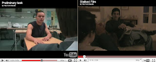
The above screen shots (the left is our preliminary, the right is our final product) show a close up shot. From using a close up of eyes in our preliminary task, we saw how it was an effective technique to use as it clearly shows the emotion of the character. As our character Lucy in our film is afraid, we wanted to highlight this and it was affective to show the shock through her eyes widening. The way we could make this the focal point of the shot was by displaying it in a close up.

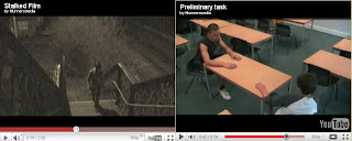
The above screen shots display our use of shot reverse shot. In our preliminary task we used the technique of shot reverse shot as it shows each character when they are speaking in conversation. By using this technique the expressions of characters will be shown by their faces which are shown, this will also show their emotion in relation to what is happening in the conversation. In these type shots we also ensured they are over the shoulder shots so that the audience know who the character is speaking to by showing their shoulder. And also in these shots we used the 180 degree rule in which the camera stays on one side of the people. This technique ensures that the viewers do not get confused as to where characters are in a room/ location and where the other character is in relation to them.


Both our preliminary task and our final film display the technique of match on action.

Above is a screen shot of our preliminary task. These two shots display match on action as they show the character opening the door, and then the next shot carries that on rather than the door being closed and then reopening it again.

Above is a screen shot of our final film. This shows the technique of match on action as it shows the victim character being handed the 'lost cat' poster, and then in the next shot, she is seen holding it in the same position which is a clear match on action between shots.

The above two screen shots show a camera movement technique that we used in both of our filming tasks. In our preliminary we used the panning technique to show the movement of somebody through a location. As we saw how this worked well there, we decided to use it in our final film also, as we wanted to show the victim character running away, and by using a slight panning shot this technique clearly displayed this.
The above two shots show the use of a high angle shot. From using it in our preliminary (right) we realised that this was an interesting shot type to use, as it adds variation to a film along with showing more of the setting. Though, it isn't good for showing emotion which is what should be shown in this scene. So when using it in our final film (left), we used it for the victim walking up the bridge and unknowingly being followed. This shot type was affective here in comparison with the preliminary task as this shot doesn't have to display any emotion, meaning that it's good to use the high angle shot to display the location.

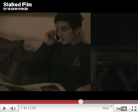
The above screen shot shows the use of the 'wipe' editing technique in our final film. This ensured separation from the victim character walking to the phone conversation, so we used this editing technique at the beginning and the end of the conversation. In comparison, in our preliminary task we did not use any editing other than just cutting between scenes. This is because we had lack of editing knowledge at this time. It would have been affective in our preliminary to include some editing such as fade in from black (which we used in our final film) etc, as it begins and ends the film well. But by not have included these editing techniques, this shows how we have progressed.

The above screen shot shows our use of editing in our final film. This editing technique is 'old film' and 'black and white' combined as we wanted to create a CCTV affect from the camera being in the corner of the bridge. We also found using the 'old film' technique is affective as it creates a sense of movement, showing how CCTV cameras are always moving and looking for action. In contrast, in our preliminary task we didn't use any editing similar to this as we did not think it was necessary. For example we didn't need to change it to say black and white, because it wasn't necessary as a 'scary' feel didn't need to be made because this wasn't a horror we were producing, it was similar to a soap opera, which usually don't include any editing like this.

Evaluation Activity 6 - Learning about technology in the process of constructing our film beginning


For our film we used the technology of a camera, tripod and computer (with adobe premier).
  • From using a camera in this course we learnt how to use it and how using a tripod is effective. We learnt this from attempting to film by holding it, but it wasn't still enough so we used a tripod and this piece of equipment solved this problem.

In this course we used Adobe Premier as our editing software.
  • This software was affective as there were many transitions available to use. We used wipe for our phone conversation scene to separate this from the victim walking and fade in/ fade out to black a lot which is affective in making the shots smooth and not just cuts in between.
  • With Adobe Premier there are also many effects used. In our film we used 'black and white' and 'old film' as this created the CCTV affect that we needed for some of the scenes of the victim walking on the bridge.
  • Adobe Premier is also useful as the audio can be edited easily and separately from the video itself. This was useful for the beginning of our film as we wanted to fade in/ fade out all of our audio, as we used music in all of the other scenes other than the ones with dialogue in them. This was also affective as we could then cut the music so that we could use the parts that we wanted to fit in the scene.
For showing our film and the progress of it we have used Youtube and Blogger.
  • Youtube is useful for showing our film as it is an easy website to use, easily uploading films. The only issues we had at first was the fact we had to convert our film beginning to an MPEG before putting it onto Youtube so it would upload successfully, but this was solved quickly so we could upload easily.
  • Another benefit of using Youtube is the fact that we can easily show this to other people and are able to get their feedback on our film through the use of comments.
  • We also used Blogger for showing the progress of making our film beginning, this is through research and planning our film, animatics, photographs, text explaining ideas and changes etc. Blogger is an effective website as it can show all of these aspects easily.

Evaluation Activity 5

Below is our film but with annotations on it created using the Youtube annotation tool. These annotations show how our film is similar to others, and what the unique selling points of our film are.
(These annotations can be viewed by placing your mouse over the boxes on some of the scenes in our film.)

Evaluation Activity 4 - Who would be the audience for your media product?


The target audience for our film is teenagers/ young adults. This is because from previous research looking at what age/ gender people watch horror films, it clearly showed it was teenagers/ young adults, and mostly men. This is because children are not able to watch, and the elderly may not be able to deal with the shocking nature of the films.   Children are not able to watch horror films because of the certificate on the film. From our questionnaire we would produce our film with a 15 certificate because then more people would be able to view it, therefore more money will be made on our film.


  • More specifically, our target audience could be of a gothic fashion. This reflects somebody who would stereotypically watch horror films.
  • Also, this image reflects that our target audience will be teenagers/ young adults, as from my audience research from before this showed that this was the age group thaty enjoyed horror films more than say elderly people, and children cannot usually watch because of certificates on films/ parents not allowing it, therefore they don't have an opinion wether they like/ dislike them.
  • By including an image of a boy and a girl, this shows that either gender enjoy this film (unlike say a film under the romance genre, which typically only women would like), but from our audience profiling research it is clear that men enjoy watching horror films more than women. But as the statistics are so close (e.g. 28 Weeks Later - 56% male, 44% female audiences) this means I have included an image of both a male and female, as they are both likely to watch.
  • The target audience for our film would shop in places like Hot Topic, Blue Bannana etc. as this style stereotypically fits with the genre of our film. They would also listen to rock/screamo music, as this music is typically associated with people of gothic style. Stereotypically their favourite TV show could be True Blood or the Vampire Diaries, which shows an interest in media that is 'scary' or of the horror genre, so they would then be interested in our film.

Evaluation Activity 3 - What kind of media institution might distribute your media product & why?

SCRIPT FOR VOICEOVER

  • the production company for our film is Ghost House Pictures. The actual logo of this is a skull which reflects the horror genre of our film, clearly showing this in the first few seconds of the film
  • a production company is responsible for the physical production of media, so they have a lot of responsibility over a film
  • The distributor for our film could be Universal Pictures. This would be an affective distributor as they distribute many films successfully, so it would be affective to have them as our distributor.
  • Various people are named in the opening of our film in the credits. The first person introduced is the person who directed the film, as they play a key part in the production of a film
  • Other people in the credits of the opening of our film are who the music is by, the stars in the film, the editor and who this is produced by. These are all included because they are jobs of importance.
  • The money for our film could have come from being sponsored by National Rail (as our film features a train). This sponsoring can be compared the Shane Meadows' Somers Town being sponsored by Eurostar, as it features this type of train.
  • Our film will first be released in the UK, to see if it's successful, and if so, it will be released worldwide. This is a good way of not wasting money, as if it wasn't successful worldwide this would be a waste. This is similar to the film ''Drag Me To Hell'' as it was released in America first, to judge whether it was going to be successful, and as they saw it was it was released worldwide also. 


Below is the voice over that we have produced over the top of our film. We propduced this by seperating the audio from our film and deleting it, then replacing it with the audio that we produced using a camera stating information about our film, such as the production, distribution, where the money will come from etc.


NOTES ON THE ABOVE

  • The production company for our film is Ghost House Pictures. The logo is a skull which reflects the horror genre of our film and clearly shows this in the first few seconds of the opening of this. Production companies are 'responsible for the physical production of media' as Wikipedia states. Wikipedia also states the fact that 'it's common for actors to form their own production companies so they can have more control over their careers' e.g the length of time the film is made over, where etc.
  • The distributor for our film could be Universal Pictures. This would be an affective distributor as they distribute many films successfully, so it would be affective to have them as our distributor.
  • The money may have come from being sponsored by National Rail. This can be compared to the film Somers Town, where the money for the film came from Eurostar.
  • Various people are named in the titles. The jobs which are named in the titles are ones of importance and which have a key part in producing the film. For our titles we used white font so that they are noticeable against the darkness of the scenes, this is so they're noticeable to the audience, meaning they see who's made the film as they're important. 
  • The first job introduced is who the film is by (the director). This is introduced first as this person is key to the whole film, so their name should be shown first as most credit should go to them.
  • Close to where a new character is introduced, the starring roles in the film are stated, this is to highlight the many different people in this film.
  •  The next credit shown is who made the music. This is introduced when the music is playing, as if it was playing when there was dialogue/ no sound it would not be understood what music he has made.
  • By introducing the credit 'edited by...' in the shot where obvious editing is, this ensures the viewer notices the editing, so the credit can go to this person.
  • 'Produced by...' is shown last before the actual film title. This is affective as this is a credit which will be remembered, as it is the last one shown.
  • Our film will first be released in the UK, to see if it's successful, and if so, it will be released worldwide. This is a good way of not wasting money, as if it wasn't successful worldwide this would be a waste. This is similar to the film ''Drag Me To Hell'' as it was released in America first, to judge whether it was going to be successful, and as they saw it was it was released worldwide also. 

Saturday 26 March 2011

Evaluation Activity 2 - Comparison of characters

IMDB page for Creep

Comparison of the victim character from creep & the victim from our film, Stalked.
  • The two are similar in the way that they are both displayed in casual clothing. This gives the idea that they are going out somewhere which isn't associated with work, so they're in casual clothing. Also, by making both of the characters wear feminine clothing, this shows they are not masculine or could stereotypically be seen as 'tough', so they would be able to defend themselves.
  • The victim in Creep is presented in a dress which gives more of an innocent feel to the character than our victim, Lucy. By having the character look more innocent, this makes it clear to the audience that this character is likely to be attacked in the film.
  • Similarly both of these characters are victims in films, being followed by the 'horror' character. The fact that these characters are both being followed is also a similarity. In Creep the woman is being followed in a train station, whereas Lucy is being followed around the streets.
  • As both characters are female, this gives a feeling of vulnerability to the characters. Stereotypically in films women cannot defend themselves, therefore the audience being more fearful for their safety in the film.
________________________________________________________________


Comparison of the father character in Silent Hill & the father character in our film, Stalked.

  • These two characters are similar as in the beginning of the films, they are both left at home not knowing what's really happening to their daughters.
  • The difference between the two characters are the fact that the father character from Silent Hill is worrying about his wife and daughter, where as the father character in our film Stalked is only going to worry for his daughter (though this isn't shown in the beginning of our film.)
  • The clothing between the two characters is slightly different as the Silent Hill father character is usually shown in his suit, where as the father character in Stalked is shown in more casual clothing, because he is shown in in the evening, therefore with no relation to work, so not wearing a suit.

Evaluation Activity 1 - How typical is the opening scene of our film


  • For the title of our film we used a plain, capital font. We didn't want to use any fonts that are like handwriting (e.g French Script) or any fonts that are rounded (e.g. Comic Sans). This is because it would give a soft look to the film. Where as using a harsh, straight font this gives the feeling this film isn't going to be a comedy, romance etc. , but a horror. We used the colour red for the font as from researching other films, it is clear that for horror films titles red is a popular colour as it represents blood, and reflects the angry feeling usually expressed in horror films.
  • We introduced the location of our film by using an establishing shot. This is something usually done in horror films, as the audience need to be clear where all of this action is taking place. This establishing shot can be compared with the establishing shot used at the beginning of the film The Ring, similarly it is an establishing shot of the house. We also used a panning camera movement with this shot to clearly show that the house the conversation is taking place in isn't alone, it is on a street with other houses, highlighting the fact that the action of the film will not happen here. This contrasts with the beginning of The Grudge as in this establishing shot the house is placed on its own, showing that the action in the film will begin here.
  • From the third screen shot it is clear we have used a prop. This prop is a knife, which clearly highlights who the victim and who the attacker is in this film. By having a close up shot of the knife this clearly shows the prop to the audience, making it clear to them some action is about to happen. In many horror films close up shots are used to highlight props which are key to events happening, e.g in the opening of The Grudge the close up of the phone ringing shows this is key.
  • The fourth screen shot shows the editing we have used in our film. We used the effects 'black and white' and 'old film' to capture the feeling of a CCTV camera. The 'old film' affect also created movement on the shots, giving across the idea that CCTV cameras are moving looking for action all the time. This isn't similar to many horror films, as a lot do not use editing in this way, though some do reduce the amount of colour in shots to give a dull feeling to the film, therefore reflecting it's not positive and is a horror film.
  • For our opening credits we used the same font as our films title. Instead we used the colour white for these, so that they are more noticeable against the dark colourings of all the shots. We decided to show the credits ontop of the opening scenes of the film, instead of being on a block colour background. This is so that the credits aren't distracting for the viewer, even though they're important we do not want the flow of the film to stop and the viewers interest to deteriorate. Some films can work using credits ontop of a block coloured background, for example in The Grudge this works well for seperating scenes which I saw in my research previously. But in The Ring, which I also researched this used credits over the top of the opening scenes which worked well in keeping the flow of the film going. Also, because the opening locations do not change a lot, this means keeping the credits over the top of the opening scenes ensures a steady flow for the film.
  • The prop the 'lost cat' poster shows the story of the opening. This prop shows why the victim is going out at night. Also the fact that she is going looking for her cat gives the feeling of innocence to the character, meaning that she is more likely to get attacked in this stereotypical horror film.
  • The genre of the film is suggested by the attacking character, as they are mysterious because of the costume (the hood covering the face and hiding the identity). Also the fact that our film is shot at night gives the idea it is a horror film, as usually attacks in horror films do not happen in the day. Also being at night gives the feeling the victim cannot be helped, as nobody will be around to help whereas they would be in the day time.
  • Two characters are introduced by the conversation scene which is typical in horror films. E.g at the beginning of The Ring, two girls are introduced to the audience through a conversation scene. The attacker is introduced by being seen following in the distance, which is typical in a horror film, as by using this technique it does not give away the identity of this character, therefore adding suspense. 

Thursday 17 March 2011

Final film - 'Stalked'

Editing using Adobe Premier

Our first piece of editing in our film beginning is at the beginning, a fade in from black. This is an affective transition to use at the beginning of the film as it introduces the first scene in a smooth way, instead of the shot straight away being there. From looking at many other horror films this technique is clearly used a lot.

This scene also fades in from black as it effectively separates the scene before (the victim and father having conversation in the house) and this one.


Also on the same scene we introduced the opening credits of the film. We introduced these credits here as it doesn't distract the viewer from the beginning of the film, the establishing shot and the conversation setting out what is happening (victim looking for lost cat). For all of the credits we used fade into line so that the credits aren't on screen for too long.

For this scene we used the wipe transition. This is to show a change of location - from where the victim is to where the victims father is. This highlights the fact that the victims father is far away showing clearly he wouldn't be able to save her.

Another wipe is used on the ending of the phone conversation. This is to separate the conversation from the victim character walking away down the stairs(as the shot of the victim on the phone is then followed by her walking away and then a shot of her walking down the bridge.)


In our film we also used the affects 'black and white' and 'old film'. This was to create a CCTV affect as we placed the camera in the corner of the bridge in both of the shots where we included these affects. Also, the 'old film' affect gave a moving feeling to the shot, emphasising the fact that CCTV cameras are constantly moving around capturing action.

At the end of the opening of our film we used text faded in from the black background. This ensures the audience focuses on the text as there is nothing else to be distracted by. The font colour is in red as this represents blood, giving the feeling of the horror genre. This colour also could show anger, which is usually an emotion portrayed in horror films. Also, from looking at many other horror films it was also clear that red is a popular colour to use.


Animatic


We have reproduced our animatic for our film as we have changed a lot. Also, in this animatic we have made each scene as about as long as each scene is going to be in our final film. This gives us an idea of how long our film will be, to ensure it's not too long/ short. We did not add in our titles as at this stage we were unsure of what they were going to be exactly, but we knew that they would start at the scene of the victim walking out of her house so that they wouldn't run over the dialogue scenes to distract the viewer away from the conversation itself, as it's key to the beginning of our film to outline what is happening.

Wednesday 16 March 2011

Opening credits in our film

For our film we have looked at the film 'The Grudge' to gain ideas for what is said in the opening credits.
From watching this we have come up with the ideas of having our opening credits as

_____ (name of director) and Columbia Pictures present
A Ghost House Pictures production
A film by _____ (writer)
_____ (main characters name)
Casting by _____
Music by _____
Editor _____
Produced by _____


Where the music will be placed in our film

  • In our film we have decided to include music to add to how tense the film is, and too add to the fear created by the 'stalker' character. In the scenes including dialogue we decided to fade out the music so that the viewers focus is on the dialogue, instead of being distracted by the music itself. 
  • We decided to start the music after the scene including dialogue inside the house. This is to show the fact that something bad will happen soon in the film.
  • We also decided to fade the music back in after the phone conversation scene as it then carries on the tense feeling in the film. The fact that the ring tone of the phone starts suddenly creates a feeling of shock and fear, showing that the victim is on edge and afraid. By suddenly having the music of the phone ringing introduced, this will shock the viewer, therefore they will emphasise with the victim character.


Tuesday 15 March 2011

Institution research for our film 'Stalked'

  • For our film we have decided to have 'Ghost House Pictures' as our production company. We chose this company as it has produced many horror films such as The Grudge. Also, we liked the name 'Ghost House' as it clearly shows to the audience that this film is of a horror genre.
  • We decided to have Universal Pictures as our distributor. This is because this company is very successful in distributing films, meaning our film may become successful because of this factor.

Additional filming

Yesterday we went out filming to re-do some of our scenes to make them more effective.
  • We re-did the conversation scene of our film beginning as part of it wasn't completely still, which could cause our film to not look similar to a real film. To the conversation scene we also added in a close up shot of the lost cat poster being picked up by the dad character (Fabian). This ensures that the focus of the scene is on the storyline of the main character (Lucy) looking for her lost cat.
  • Also, we added in a phone conversation to add more dialogue and action into our film, rather than it just consisting of the victim character walking around. By adding in the phone conversation this makes it clear that the victim character, Lucy, is looking for her cat, and her dad is waiting at home for her.
  • We also added in a knife to the 'stalker' character following the main character (Lucy) walking down the stairs. This adds more affect to our film, clearly showing why the main character is fearful and running away.

Thursday 10 March 2011

Choice of film title

For our film title we have chosen the name 'STALKED'.
We chose this name for the title as our film has changed from a film including zombies to a film that is a type of thriller, which includes somebody being followed by a character with a knife.

For our film titles we have chosen to use the font Trajan Pro. This is because it is similar to the fonts used in other film titles, as they are in capitals and quite plain fonts, reflecting the fact that we don't want to give away much about our film.

To do list produced after editing

After beginning to edit our film we came up with a to do list of things we need to do to make our film a lot better:

1. Add Ghost House Pictures title to the start of our film (idea gained from watching the beginning of The Grudge)

2. Choose font for the titles of our film. (We are using a black background and red fonts)

3. Redo the inside shots of conversation
  • Less camera movement – put camera on tripod
  • Make sure posters fit across the two scenes
  • Close ups of holding the posters 
4. Shot of Lucy walking out of the house

5. Shot of cat poster being put up (Longer length)

6. Shot of Lucy walking down stairs – Stalking character viewed with knife (so the audience clearly know why the main character Lucy is running away)
  • As lucy gets to half way down the stairs sammy gets knife out of pocket which is visible to the camera
7. Cut the above scene so that it fits with the point of view shot going around the corner


Editing in class

Today during our media lesson we decided to edit our film. Above is a screen shot of this happening.

When editing we noticed that the first scenes of our film (displayed above) was not shot steady, so we will be re-filming parts of these scenes so that it looks a lot better. Also, we noticed that the scene did not flow together, as when the main character is passed the 'lost cat' poster, in the next scene the paper was the other way round. So when re-filming we will take in mind all of these things. We also decided on this scene to add in close ups of the father character picking up the posters, so that there is emphasis on what the posters is about (the lost cat).

Changes of the 'horror' characters and props

In our film we have changed the character that is meant to be scary. Originally we were going to have zombie characters, but we realised with this it would not look like a real film as we do not have the special effects/ makeup to produce a realistic zombie character.
Instead we stayed with the idea of the victim coming across a scary character and being followed and attacked, but instead we changed this to just a person with a knife that cannot be seen clearly except just before the title 'STALKED' is shown at the beginning of the film, but again in this shot we didn't want the stalking character to be clearly shown just to make the film more tense and mysterious, as horror films are.


Above are images displaying the stalker characters clothing. We chose to have this character in a Parker coat with the hood up, as this adds to the mystery of who is following the victim as it cannot be seen whether this character is male/ female. As most of our shots of the stalker character are either far away or from behind, this also adds to the mysterious feeling as it cannot be seen properly who this is. As the jeans and shoes could belong to either a male or female character, this also adds to the mystery of the film for the audience, as they cannot be sure who it is at all, making this character more feared as they could be any of the characters in the rest of the film but disguised to attack other people.
________________________________________________________________

As we have changed our film location, we decided to rid of the tortch prop as it wasn't nessicary because we now have enough light to work with and for the characters to be visible. We instead are using a knife to show why the victim character is afraid of the stalker. We use a close up shot of this prop to highlight its importance in our film, as this gives across what genre our film is. We did not show this knife in the light as it isn't a real knife, so to give across the idea that it is real we showed it in the dark, giving a more realistic look to it.


________________________________________________________________


We also decided to add into our film a phone conversation to clearly highlight what the victim character is doing (looking for her cat). We had a close up of the phone recieving a call to show its importance in the film. Below displays the screen shots of our phone conversation scenes (the first screen shot of the victims father on the phone, the second screen shot displaying the close up of the phone going off so that the focus is on the fact that this is happening.)


Tuesday 8 March 2011

Why we changed the location

In our first attempt of filming we realised by using a torch in the dark doesn't work as effectively as we thought because of the fact that the camera couldn't focus well in this low amount of dark, so we decided to change location to somewhere with more lighting.
Also, as the trees etc to show the rural setting cannot be seen, this eliminates the rural setting idea and the feeling of loneliness and the fact that the character cannot be saved. By changing the setting to on the bridge this gives the idea of loneliness as nobody is around, and also trees etc can be seen, giving a rural and lonely feel as we originally intended.